These days it's all about Big Data. Internet Of Things! Deep Learning! Smart Grids! Petabytes! But what's all the worlds data worth, if you can't make any sense of it? How do we identify the useful patterns or interesting relationships in our datasets?
A great way to quickly make sense of data are choropleth maps. Few people might have heard the term, so what is a "choropleth map"?
A choropleth map (from Greek χῶρος ("area/region") + πλῆθος ("multitude")) is a thematic map in which areas are shaded or patterned in proportion to the measurement of the statistical variable being displayed on the map, such as population density or per-capita income.
And in this article I want to show you how to generate choropleth maps in R.
All scripts, queries and resources used in this post can be found at:
Visualizing Temperatures
I am currently working on an article on Columnstore Indexes with SQL Server 2016, so I have aggregated quite some data to work with. The data all my recent posts are based on is the Quality Controlled Local Climatological Data (QCLCD), which contains a list of US weather stations and various climatological measures.
In this article I want to generate a choropleth map for visualizing the average temperature for US states and counties.
The basic idea for the R script is to use RODBC for connecting to the database, infuser for building the query and ggplot2 for plotting the data. I will use the albersusa package for the shapefiles, and the sp package for geographical projections. Finally viridis provides great color scales for visualizing temperature data.
About the Dataset
The dataset is the Quality Controlled Local Climatological Data (QCLCD) for 2014 and 2015. It contains hourly weather measurements for more than 1,600 US Weather Stations. It is a great dataset to learn about data processing and data visualization:
The Quality Controlled Local Climatological Data (QCLCD) consist of hourly, daily, and monthly summaries for approximately 1,600 U.S. locations. Daily Summary forms are not available for all stations. Data are available beginning January 1, 2005 and continue to the present. Please note, there may be a 48-hour lag in the availability of the most recent data.
The data is available as CSV files at:
SQL Query Template
The SQL Query first calculates the average temperature for each station in a given time range, and then
joins the result with the geographical position of the station given by its latitude and longitude. The
climatological data is given in the table sample.LocalWeatherData, the station data is given in the
table sample.Station:
WITH AverageTemperatues AS(
    SELECT d.WBAN as wban, AVG(d.Temperature) as temperature
    FROM sample.LocalWeatherData d
    WHERE d.Temperature IS NOT NULL AND d.Timestamp BETWEEN '{{start_date}}' AND '{{end_date}}'
    GROUP BY d.WBAN
)
SELECT s.WBAN as wban, s.Latitude as lat, s.Longitude as lon, t.Temperature as temperature
FROM sample.Station s
    INNER JOIN AverageTemperatues t on s.WBAN = t.WBAN
R Script
I have commented the Script, so each line is explained.
# Copyright (c) Philipp Wagner. All rights reserved.
# Licensed under the MIT license. See LICENSE file in the project root for full license information.
library(RODBC)
library(dplyr)
library(infuser)
library(readr)
library(magrittr)
library(albersusa)
library(viridis)
library(ggthemes)
library(ggplot2)
library(readr)
library(sp)
# Connection String for the SQL Server Instance:
connectionString <- "Driver=SQL Server;Server=.;Database=LocalWeatherDatabase;Trusted_Connection=Yes"
# Connect to the Database:
connection <- odbcDriverConnect(connectionString)
# Read the SQL Query from an external file and infuse the variables. Keeps the Script clean:
query <- read_file("D:\\github\\WeatherDataColumnStore\\WeatherDataColumnStore\\R\\maps\\query.sql") %>%
infuse(start_date="2015-07-01 00:00:00.000", end_date="2015-07-31 23:59:59.997", simple_character = TRUE)
# Query the Database:
station_temperatures <- sqlQuery(connection, query, as.is=c(TRUE, FALSE, FALSE, FALSE))
# Close ODBC Connection:
odbcClose(connection)
# Load the US Shapefile:
usa <- counties_composite()
# Exclude Hawaii and Alaska:
usa <- usa[!usa$state_fips %in% c("02", "15"),]
# Define the Coordinates of the Station:
pts <- as.data.frame(station_temperatures[,c("lon", "lat")])
coordinates(pts) <- ~lon+lat
# Assign the WGS84 Coordinate System to the Points:
proj4string(pts) <- proj4string(usa)
# Project each Station Position into the US Map:
merged_temperatures <- bind_cols(station_temperatures, over(pts, usa))
# Plot the Station Temperatures:
state_temperature <- merged_temperatures %>%
group_by(state) %>%
summarize(meanTemperature = mean(temperature, na.rm = FALSE))
us_state_map <- fortify(usa, region="state")
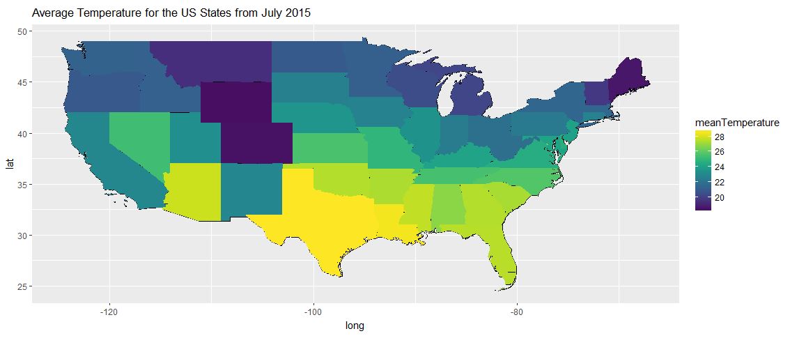
gg_state_temperatures <- ggplot() +
ggtitle("Average Temperature for the US States from July 2015") +
geom_map(aes(x = long, y = lat, map_id = id), data = us_state_map, map = us_state_map, fill = "#ffffff", color = "#000000", size = 0.15) +
geom_map(data=state_temperature, map=us_state_map, aes(fill=meanTemperature, map_id=state), size=0.15) +
scale_fill_viridis(na.value='#404040') +
coord_fixed(x=us_state_map$long,y=us_state_map$lat) +
theme(legend.position="right")
gg_state_temperatures
# Plot the County Temperatures:
counties_temperature <- merged_temperatures %>%
group_by(fips) %>%
summarize(meanTemperature = mean(temperature, na.rm = FALSE))
us_counties_map <- fortify(usa, region="fips")
# Plot the Map with Stations:
gg_stations <- ggplot() +
ggtitle("Positions of US Weather Stations in 2015") +
geom_map(data=us_counties_map, map=us_counties_map, aes(x=long, y=lat, map_id=id), color="#2b2b2b", size=0.1, fill=NA) +
geom_point(data=station_temperatures, aes(x=lon, y=lat), color="red") +
coord_fixed(x=us_counties_map$long,y=us_counties_map$lat) +
theme_map()
gg_stations
gg_county_temperatures <- ggplot() +
ggtitle("Average Temperature for the US Counties from July 2015") +
geom_map(aes(x = long, y = lat, map_id = id), data = us_counties_map, map = us_counties_map, fill = "#ffffff", color = "#000000", size = 0.15) +
geom_map(data=counties_temperature, map=us_counties_map, aes(fill=meanTemperature, map_id=fips), size=0.15) +
scale_fill_viridis(na.value='#404040') +
coord_fixed(x=us_counties_map$long,y=us_counties_map$lat) +
theme(legend.position="right")
gg_county_temperatures
Results
R provides high-quality plots, that can be used for publications. But the bandwidth for my page is limited, so I am providing only scaled down and low quality images of the results. You should be able to generate high quality plots recreating the plots with the resources of the GitHub repository.
Average Temperatures by State
Position of the Weather Stations

Average Temperatures by County
